본 글은 한국어로 작성되었으며, 글 하단에서 영문 번역본을 확인하실 수 있습니다.
(Scroll down to the bottom for the English version of this post.)
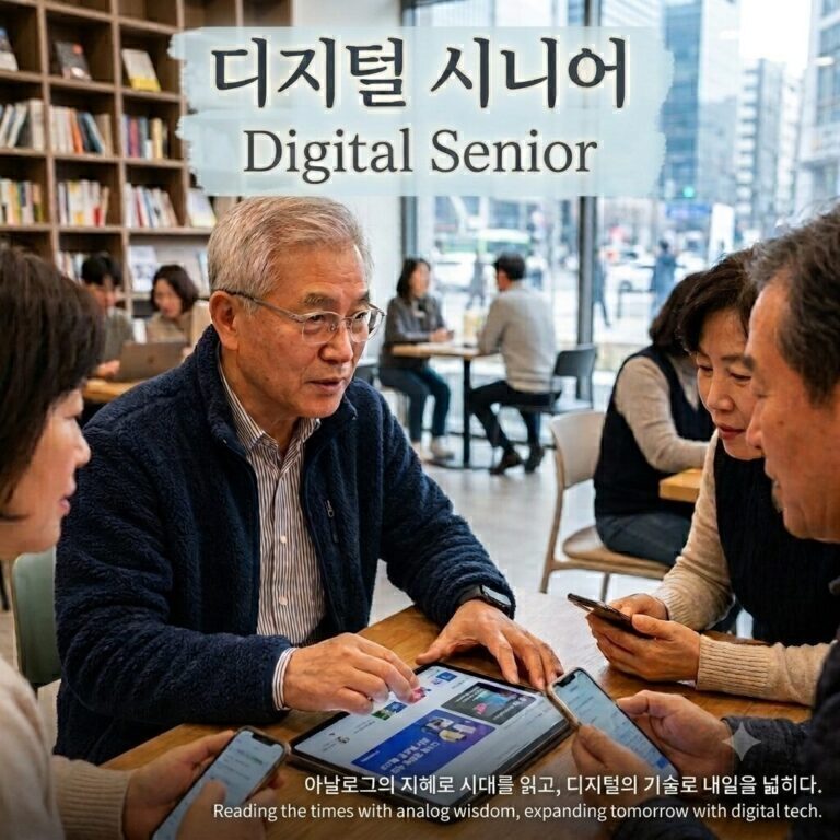
우리 사회가 초고령화 시대로 진입하면서 디지털 기기의 화면 속 작은 글씨와 복잡한 아이콘은 시니어 세대에게 거대한 장벽이 되고 있습니다. 이제 나이는 단순한 숫자를 넘어 스마트폰의 글꼴 크기로 증명되는 시대이며, 시니어 친화적 디자인은 선택이 아닌 필수적인 생존 조건입니다. 소외되는 사람 없이 모두를 포용하는 인클루시브 디자인이 왜 현대 디지털 생태계의 가장 중요한 핵심 트렌드로 부상하고 있는지 심층적으로 분석합니다.
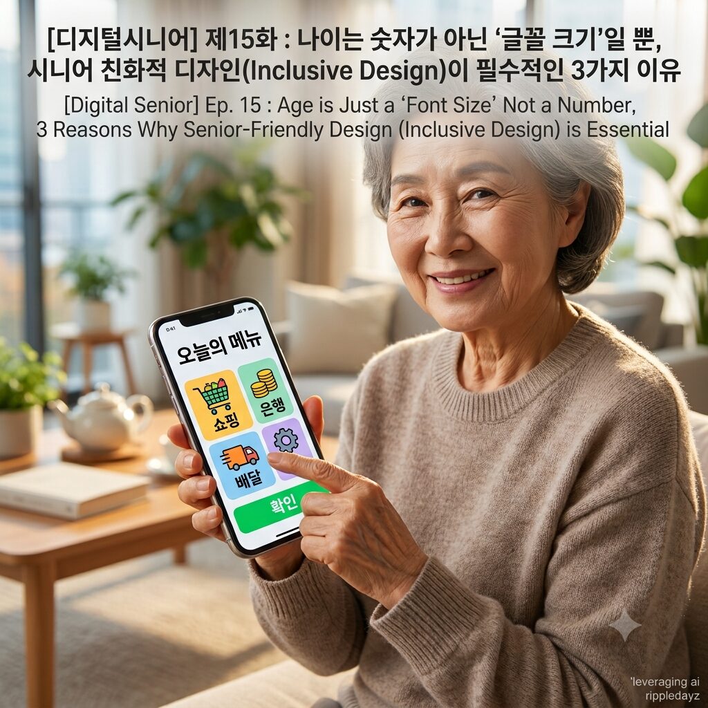
시니어 친화적 디자인이 현대 디지털 생태계에서 필수적인 3가지 핵심 원인
오늘날 스마트폰 앱이나 웹사이트를 개발하는 젊은 기획자와 디자이너들은 종종 자신들의 시력과 인지 능력을 기준으로 화면을 구성하는 치명적인 오류를 범하곤 합니다. 세련되고 미니멀한 디자인이라는 명목 아래 숨겨진 메뉴와 희미한 글씨체는 디지털 기기를 매일 사용해야 하는 노년층에게 끔찍한 스트레스와 디지털 소외감을 안겨줍니다. 모바일 플랫폼과 IT 기업들이 앞다투어 시니어를 배려하는 인클루시브 디자인(Inclusive Design)을 적극적으로 도입할 수밖에 없는 세 가지 핵심적인 이유를 세밀하게 분석합니다.
- 노화로 인한 신체적 변화와 미세한 터치 조작의 물리적 한계 극복 나이가 들면 피할 수 없는 노안으로 인해 시력이 저하되고, 대비를 명확하게 구분하는 능력이 현저하게 떨어지게 됩니다. 이러한 상황에서 회색 바탕에 연한 회색으로 적힌 약관이나 지나치게 작은 글꼴은 시니어들에게 정보 접근을 원천적으로 차단하는 거대한 유리 천장과도 같습니다. 또한, 손가락 끝의 수분이 감소하고 미세한 근육 운동 능력이 저하되면서 작은 버튼을 정확하게 터치하거나 복잡한 스와이프 제스처를 수행하는 것이 육체적으로 매우 힘든 노동이 됩니다. 따라서 버튼의 크기를 대폭 키우고 요소 간의 간격을 여유롭게 배치하며, 명도 대비를 확실하게 주어 시각적 인지성을 높이는 시니어 친화적 디자인은 노년층의 신체적 한계를 기술로 보완하는 가장 훌륭한 배려입니다.
- 직관성을 잃어버린 복잡한 UI가 유발하는 인지적 과부하 문제의 해결 최근 유행하는 모바일 디자인 트렌드는 화면을 깔끔하게 보이기 위해 중요한 메뉴를 이른바 햄버거 아이콘(석 줄짜리 기호) 속에 숨기거나 그림자를 없애는 플랫 디자인(Flat Design)을 선호합니다. 하지만 과거 현실 세계의 메타포를 빌려온 입체적인 버튼에 익숙한 시니어 세대에게 이러한 평면적인 아이콘과 숨겨진 메뉴는 무엇을 눌러야 할지 알 수 없게 만드는 거대한 미로와 같습니다. 새로운 정보를 학습하고 단기 기억에 저장하는 인지 능력이 저하된 시니어들에게 암호를 풀듯 화면을 조작하게 만드는 것은 심각한 인지적 과부하를 유발하고 결국 앱 사용을 포기하게 만듭니다. 기능을 명확한 텍스트로 풀어 설명하고, 오류가 발생했을 때 어떻게 돌아가야 하는지 친절하게 안내하는 굵직하고 직관적인 디자인만이 시니어들의 디지털 자신감을 회복시킬 수 있는 유일한 열쇠입니다.
- 시니어 세대의 막강한 경제력과 초고령 사회가 요구하는 거대한 시장의 변화 디지털 기업들이 시니어 친화적 디자인에 사활을 거는 가장 현실적이고 결정적인 이유는 바로 시니어 세대가 가진 막강한 자본력과 실질적인 소비력 때문입니다. 이른바 액티브 시니어라 불리는 현대의 노년층은 과거와 달리 온라인 쇼핑, 모바일 뱅킹, 배달 앱 등을 적극적으로 사용하며 디지털 경제의 거대한 큰손으로 자리 잡았습니다. 이들의 시력과 인지 능력을 배려하지 않는 불친절한 디자인의 플랫폼은 곧바로 이 거대한 소비층의 외면을 받고 시장에서 도태될 수밖에 없는 치열한 비즈니스 환경이 조성되었습니다. 결국 인클루시브 디자인은 단순한 기업의 사회적 책임을 넘어서, 1조 달러 규모로 성장하고 있는 글로벌 에이지테크(AgeTech) 시장을 선점하기 위한 가장 필수적이고 수익성 높은 기업 생존 전략입니다.
인클루시브 디자인이 완성할 미래 사회의 포용적 디지털 생태계
시니어를 위해 고안된 크고 직관적인 디자인은 결과적으로 노년층뿐만 아니라 시각 장애인, 일시적인 부상을 입은 사람, 나아가 모든 일반 사용자에게도 훨씬 편안하고 쾌적한 사용 경험을 제공합니다. 앞으로는 인공지능 기술이 사용자의 나이와 시력, 그리고 스마트폰을 쥐는 습관을 실시간으로 분석하여 그 사람에게 가장 최적화된 글꼴 크기와 버튼 배열을 자동으로 생성해 주는 ‘동적 반응형 인클루시브 UI’ 시대가 열릴 것입니다. 이는 사용자가 기계의 복잡한 방식에 억지로 맞추어 학습하는 시대가 끝나고, 기계가 사용자의 신체적 특징과 인지적 한계를 이해하고 스스로 모습을 바꾸는 진정한 인간 중심의 디지털 혁명을 의미합니다. 정부와 공공기관 역시 시니어의 접근성을 보장하는 디지털 디자인 표준 가이드라인을 법제화하여, 나이가 들었다는 이유로 그 어떤 시민도 필수적인 정보와 공공 서비스에서 소외되지 않도록 촘촘한 기술적 안전망을 구축해야만 합니다. 디지털 세상의 품격은 얼마나 화려하고 복잡한 기술을 구현하느냐가 아니라, 가장 취약한 사용자를 얼마나 따뜻하고 세심하게 품어낼 수 있느냐에 따라 결정될 것입니다.
당신은 부모님의 스마트폰 글꼴 크기가 몇 단계로 설정되어 있는지 알고 계십니까
우리가 명절에 부모님의 낡은 스마트폰을 무심코 들여다보았을 때, 화면의 절반을 꽉 채울 만큼 거대하게 설정된 글꼴 크기를 보고 속으로 웃어넘기거나 답답해한 적은 없으십니까. 그 투박하게 커다란 글자들은 단순히 노안의 결과물이 아니라, 어지러운 디지털 세상 속에서 당신이 보낸 안부 문자 하나를 놓치지 않으려는 부모님의 절박하고도 따뜻한 생존 방식 그 자체입니다. 우리가 최신 유행하는 다크 모드와 세련된 폰트에 열광하며 앱의 디자인을 논할 때, 누군가는 그저 송금 버튼 하나를 명확하게 찾기 위해 두꺼운 돋보기를 쓴 채 화면과 치열하게 사투를 벌이고 있습니다. 오늘 저녁 부모님을 만나 뵙게 된다면, 부모님의 폰 화면이 너무 밝지는 않은지 메뉴 버튼을 누르는 데 불편함은 없으신지 먼저 살피고 글자 크기와 대비를 가장 편안하게 재설정해 드리는 다정한 디지털 주치의가 되어 주시길 바랍니다.
ripple point
나이는 단순한 숫자가 아니라 디지털 화면 속 글꼴 크기로 증명되며, 시니어를 배려하는 인클루시브 디자인은 모두를 위한 가장 따뜻하고 혁신적인 기술의 완성이다.
제15화 : 나이는 숫자가 아닌 '글꼴 크기'일 뿐, 시니어 친화적 디자인(Inclusive Design)이 필수적인 3가지 이유
해시태그
#시니어친화적디자인 #인클루시브디자인 #디지털접근성 #유니버설디자인 #고령친화디자인 #노년층UI #시니어UX #큰글씨모드 #글꼴크기 #고령자디지털소외 #디지털배려 #시니어스마트폰 #에이지테크디자인 #노인사용성 #웹접근성 #앱디자인트렌드 #초고령사회디자인 #디지털포용 #시니어인터페이스 #화면확대
English Version Available Below
Ep. 15 : Age is Just a ‘Font Size’ Not a Number, 3 Reasons Why Senior-Friendly Design (Inclusive Design) is Essential
As our society enters a super-aged era, the small fonts and complex icons on the screens of digital devices are becoming a massive barrier for the senior generation. We are now in an era where age goes beyond simple numbers and is proven by the font size on a smartphone, and senior-friendly design is not an option but an essential condition for survival. We deeply analyze why Inclusive Design, which embraces everyone without leaving anyone alienated, is emerging as the most important core trend in the modern digital ecosystem.
3 Core Reasons Why Senior-Friendly Design is Essential in the Modern Digital Ecosystem
Today, young planners and designers who develop smartphone apps or websites often commit the fatal error of configuring screens based on their own eyesight and cognitive abilities. Under the pretext of sleek and minimalist design, hidden menus and faint fonts bring terrible stress and a sense of digital alienation to the elderly who have to use digital devices every day. We meticulously analyze three core reasons why mobile platforms and IT companies have no choice but to actively introduce Inclusive Design that considers seniors.
- Overcoming physical changes due to aging and the physical limitations of precise touch manipulation As people get older, presbyopia inevitably decreases eyesight, and the ability to clearly distinguish contrast drops significantly. In such a situation, terms and conditions written in light gray on a gray background or excessively small fonts are like a massive glass ceiling that fundamentally blocks seniors from accessing information. Furthermore, as moisture in the fingertips decreases and fine motor skills decline, accurately touching a small button or performing a complex swipe gesture becomes physically exhausting labor. Therefore, a senior-friendly design that greatly increases the size of buttons, arranges ample space between elements, and enhances visual recognition with clear brightness contrast is the greatest consideration that supplements the physical limitations of the elderly with technology.
- Solving the problem of cognitive overload caused by complex UIs that have lost intuitiveness Recent trendy mobile design trends prefer Flat Design, which hides important menus inside so-called hamburger icons (three-line symbols) or removes shadows to make the screen look clean. However, for the senior generation accustomed to three-dimensional buttons borrowing metaphors from the physical world of the past, these flat icons and hidden menus are like a giant maze that makes them unaware of what to press. Making seniors, whose cognitive ability to learn new information and store it in short-term memory has declined, manipulate the screen as if deciphering a code causes severe cognitive overload and eventually makes them give up using the app. Only bold and intuitive designs that explain functions in clear text and kindly guide them on how to go back when an error occurs are the unique keys to restoring the digital confidence of seniors.
- The immense economic power of the senior generation and the massive market shift demanded by a super-aged society The most realistic and decisive reason digital companies are staking their lives on senior-friendly design is precisely the immense capital power and practical purchasing power possessed by the senior generation. Unlike the past, the modern elderly, so-called Active Seniors, actively use online shopping, mobile banking, delivery apps, etc., establishing themselves as massive big spenders in the digital economy. A fierce business environment has been created where platforms with unkind designs that do not consider their eyesight and cognitive abilities are immediately shunned by this massive consumer group and inevitably fall behind in the market. Ultimately, beyond simple corporate social responsibility, Inclusive Design is the most essential and highly profitable corporate survival strategy to preempt the global AgeTech market growing to a trillion-dollar scale.
The Inclusive Digital Ecosystem of Future Society Completed by Inclusive Design
Large and intuitive designs devised for seniors ultimately provide a much more comfortable and pleasant user experience not only for the elderly but also for the visually impaired, people with temporary injuries, and even all general users. In the future, an era of ‘Dynamically Responsive Inclusive UI’ will open, where artificial intelligence technology analyzes the user’s age, eyesight, and smartphone gripping habits in real-time to automatically generate the most optimized font sizes and button arrangements for that person. This signifies the end of the era where users forcefully adapt and learn the complex methods of machines, and a true human-centric digital revolution where machines understand the physical characteristics and cognitive limitations of users and change their own appearances. The government and public institutions must also legislate digital design standard guidelines that guarantee accessibility for seniors, building a tight technical safety net so that no citizen is alienated from essential information and public services just because they have grown old. The dignity of the digital world will be determined not by how flashy and complex technologies are implemented, but by how warmly and meticulously it can embrace the most vulnerable users.
Do You Know What Level the Font Size on Your Parents’ Smartphone is Set To?
When we casually looked into our parents’ old smartphones during holidays, have you ever laughed inwardly or felt frustrated seeing the font size set so massively as to fill half the screen? Those clunkily large letters are not simply a result of presbyopia, but the desperate and warm survival method of your parents not to miss a single greeting text you sent amidst the dizzying digital world. While we rave about the latest trendy dark mode and sophisticated fonts and discuss app design, someone is fiercely battling the screen wearing thick reading glasses just to clearly find a single money transfer button. If you get to meet your parents tonight, I hope you become a sweet digital doctor who first checks if their phone screen is too bright or if there is any discomfort in pressing menu buttons, and resets the font size and contrast to be the most comfortable.
ripple point
Age is not a simple number but is proven by the font size on a digital screen, and Inclusive Design considering seniors is the completion of the warmest and most innovative technology for all.
Ep. 14 : “Grandma Learns to Code Too” 3 Surprising Changes in the Scene of Senior Digital Literacy Education
Hashtag
#SeniorFriendlyDesign #InclusiveDesign #DigitalAccessibility #UniversalDesign #AgeFriendlyDesign #ElderlyUI #SeniorUX #LargeFontMode #FontSize #ElderlyDigitalAlienation #DigitalConsideration #SeniorSmartphone #AgeTechDesign #ElderlyUsability #WebAccessibility #AppDesignTrend #SuperAgedSocietyDesign #DigitalInclusion #SeniorInterface #ScreenMagnification